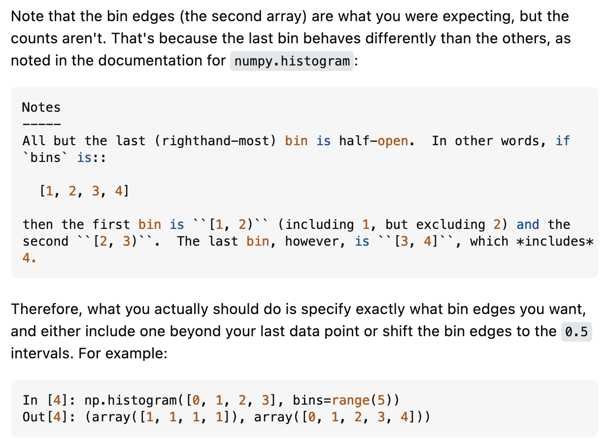
tl;dr creating bins for a histogram of discrete data in numpy can be a bit tricky since the last bin is inclusive, so we have to shift the bins by half, and then add our own ticks
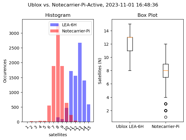
For example, I was comparing multiple GPS/GNSS receivers which report back how many satellites they have a fix on, which I stored in a dataframe as df['satellites']. The maximum value I found was 15, and the minimum was 1 satellite.
Generally we want to create the bins from (min - 0.5) ... (max + 0.5) since we want the bins centered on the integer values for our discrete data. It’s easiest to do this with bins = np.arange(min, max + 2) - 0.5. Since np.arange(start, end) is not inclusive of end we need the extra +2.
So in the case of , we need to create a sequence 1...16 and then shift it down by 0.5 so that the first bin is [0.5, 1.5) and the last bin will be [14.5, 15.5]. In numpy this is `bin_edges = np.arange(1, np.max(data) + 2) - 0.5:
bin_edges = np.arange(1, np.max(df1['satellites']+2)) - 0.5 And then we create the ticks for the center of the bins, which is [min,...,max], or np.arange(min, max + 1):
ticks = np.arange(1, np.max(df1['satellites'])+1)Input
bin_edges = np.arange(1, (np.max(df1['satellites']+2)))-0.5
ticks = np.arange(1, (np.max(df1['satellites'])+1))
ax1.hist(df1['satellites'], bins=bin_edges, rwidth=0.8, color='blue', alpha=0.5, label='LEA-6H')
Output
Bin Edges: [ 0.5 1.5 2.5 3.5 4.5 5.5 6.5 7.5 8.5 9.5 10.5 11.5 12.5 13.5 14.5 15.5] Ticks: [ 1 2 3 4 5 6 7 8 9 10 11 12 13 14 15]
Note we can also verify we have the right bins with:
df1["satellites"].value_counts().plot(kind='bar')
Key point: Bins are “half-open”, except for the rightmost bin.
Final Graph:
TODO add links to projects